My journey with Split Toning…
Yes I’m an oldie! I remember the transition from B&W tv to Colour. Mind you my first experience of colour tv in my uncles’ house watching my favourite football team in the day (Leeds United) lose the English FA cup back in 1973 was not the best introduction. But that’s for another day!
I also remember well my father agonising whether to transition his home-built darkroom in the attic from B&W equipment to colour, and deciding - based on cost and complexity - to defer.
Colour slides, of course, have long been around. Remember the days of sending off your Kodachrome or Fujifilm cartridge in the post and waiting a week or so to get them back from the lab? No idea - but hoping for the best - what they would turn out like. Slideshows - aah…! Yawn sometimes…!
Yes I’ve been on a journey from those days to what we have now. Many of us have similar memories. And whether it’s somewhat sentimental, somewhat purist, somewhat exploration, many photographers process in B&W these days. Digitally (as well as analog of course still but that is a bridge too far for me right now!)
Whether it’s shooting in a B&W preset format in JPEG or using the likes of Nik Silver Efex to process your RAW images, the desire is similar. To view your image in monochrome. Shadows. Subtleties. Shades (dare I say it - no..). They’re great. And yet - depending on the image - I feel something more could be added. Not always but quite often.
Enter Split Tone. What is that you might be asking? Another gimmick or fad? Or Lightroom preset? Well - no and yes, I guess.
What isn’t it? It’s not sepia toning - although it may look similar at times. Sepia is adding a single colour to a B&W image whereas split toning adds at least 2 colours - and sometimes more - to the monochrome photo. Sepia goes back to the 1850s and was used extensively as, apart from the aesthetic value of visually warming up a photo and making it more attractive, the chemicals used in the darkroom allowed for the printed photograph to age significantly better than standard black & whites.
Neither is split toning new to photography and if you want to learn, in quite some detail, the history of toning and photography, the excellent website Alternative Photography has an article here.

The term comes from the idea that you add one colour to the shadows, and another to the highlights, effectively “splitting” the tones of the photo.
Essentially, split toning is adding at least 2 colours to a (traditionally) black and white photograph. One to the shadows area and another colour to the highlights area. Usually the shadows get a cooler colour than the highlights area, which usually get a warmer colour. Unlike single toning or e.g. sepia, the added interest of working with split toning is that, as there are always at least two colors added, contrast is accentuated as well as giving a focal point or a symbolic meaning to the image.
Not just any (two) colours, but ones that have a harmonious nature to them - like complementary colours or split complementary colours. The colour wheel on Adobe website shows these possibilities and schemes visually.
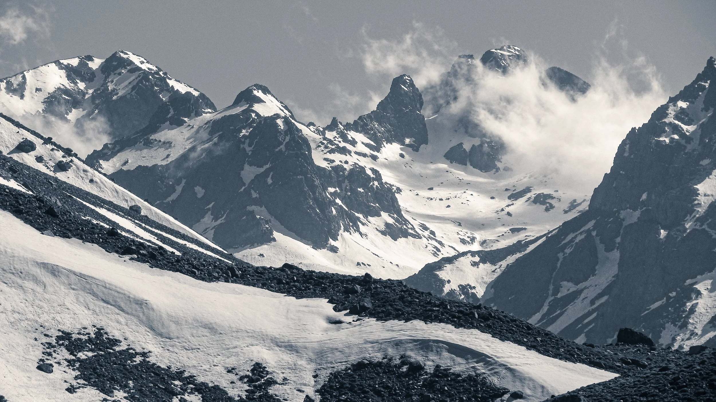
Whilst preferring B&W photos for my mountain landscapes over colour (even though I did enjoy the Fuji slides in the day!), as mentioned above, I was still looking for something extra to bring out the highlights and shadows. More by accident than design I came across the concept of split toning and played around with it, liking what I saw. My early attempts were way over saturated but reading some excellent articles on the process, helped greatly.
Earlier releases of Lightroom allowed for straightforward renditioning of the image as there was a specific Split Tone panel in the Develop module but since 2020 the process is managed in the Color Grading panel. I’m certainly no expert in Lightroom but, like all things, there are many links and YouTube videos out there that explain the process.
And there we have it. I hope you enjoy the images on the front page of my website and that by following the links in this article you will learn more about the technical and workflow aspects to this technique.
Don’t overlook that you can now buy some of these images on A2 or A3 size on my expanding Store - many of which display the split tone technique.
As always, if you have any thoughts or comments, drop them in the box below.